Cara Thompson, Data Visualisation Consultant
Let your plots do the heavy lifting!
From instantly communicating key insights, to fostering conversations beyond your initial audience — via that “wow” factor and a clear visual identity for your work — beautifully crafted and memorable data visualisations are an undisputed asset in maximising the impact of your expertise.
Data-to-Viz Commissions
From intuitive and memorable graphs that tell a clear story to bold data-driven visual statements, let’s get straight from your data to conversation-starting visuals.
Dataviz Design Systems
A bespoke dataviz-friendly colour scheme, fonts and text setting all tested for accessibility, for stand-out plots that look on-brand, every time.
Training, Consultation and Mentoring
Level up your plots and build confidence in your own dataviz work, within your organisation, one-to-one or as part of a small group of peers.
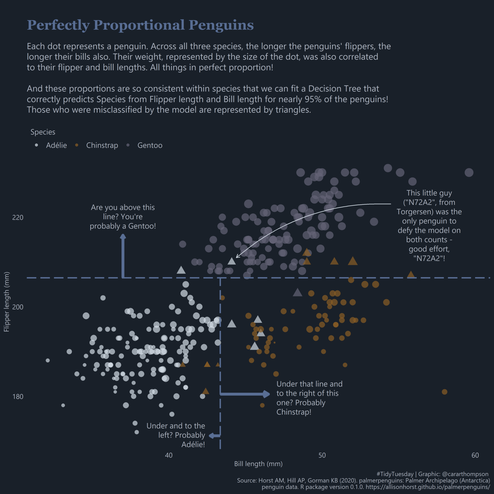
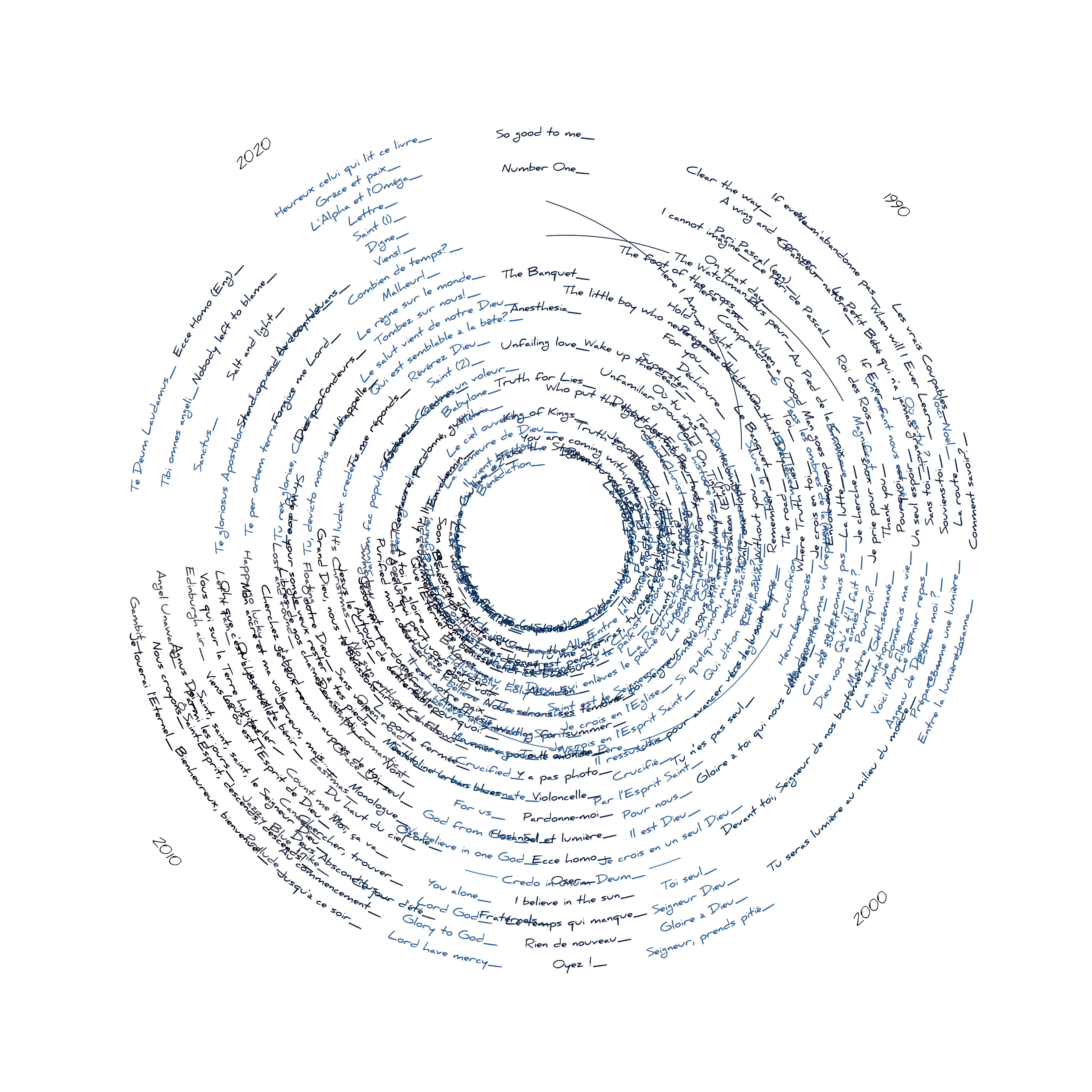
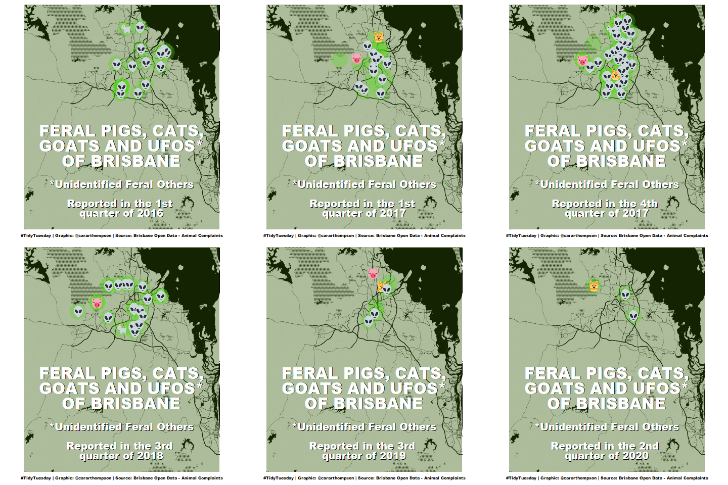
Stand-out visualisations
Conversation-starting visuals with memorable stories, created straight from the data.



A collaborative approach
A successful project depends on your expertise as much as mine. So the first step is typically an invitation to book a call so I can find out more about what you have in mind.
In our initial call, we’ll establish the aims of the project and gather as much information as we can. Whether through training, dataviz toolkits, or commissions, the aim is always the same: clients feeling confident that they can use data visualisations to communicate important patterns in their data in a way that will engage their audience.
After we’ve gathered enough information and discussed a few potential solutions, I’ll send you a proposal which outlines some timelines and our shared responsibilities, and make a start on your project once we’re both happy with the plan.
My whole approach is tied to how I got into dataviz in the first place. (Of course, I made a graph about that.)

What recent clients say
About the process of working with me
Cara is one of the most talented data viz designers in the R community. With a keen eye for aesthetics and serious skill to implement her visions through code, Cara creates high-quality data viz that is lovely to look at and communicates effectively.
David Keyes • Founder of R for the Rest of Us
Thank you for your incredible work and support to advance BHF projects working alongside the team - we are very grateful for your expert contribution. We are all very impressed with the flexibility and expertise you offered us and look forward to working together on many more things.
Rony Arafin • Director of Health Insights at the British Heart Foundation
Cara helped me create a cohesive visual identity for my brand and implement it in an R package. It’s provided immediate value to my work by dramatically reducing the time needed to go from a good idea to a professional-quality data visualization output. Cara has been great to work with.
Teal Emery • Founder & Lead Researcher of Teal Insights
What stands out was Cara’s ability to integrate the statistical nature of the data, the technical and administrative context, and the user’s needs, and then to use her mastery of R/ggplot2 to render something both functional and visually engaging.
Rob James • Founder of Evidently